Thursday, December 10, 2009

A Semester's work from Painting Class

Finals are here so I'm almost done with this semester. Today, I had my final critique with my Painting professor. By the end of that class, I have completed eight total works. Three of them were paintings on large canvases or panels we built and stretched ourselves and five were on 9" x 12" pre-made canvases.

This is the very first piece we made. It is a self-portrait done with a glazing technique on a 9" x 12" canvas. I used oil paint and a glazing medium a liquin original on this piece. Glazing involves laying down several layers of translucent paint (one at a time) over top of each other. This way the colors are not blending physically, like mixing colors on a palette, but optically. For example, when yellow undertones shine through a translucent layer of blue, they appear green.


This is another self-portrait on a 9" x 12" canvas. For this piece, we had to paint ourselves in one sitting, experimentally mixing all sorts of usual colors together while the paint was still wet. Also, my professor had us paint the canvas completely with Alizarin Crimson (red) first!


This is the final self-portrait we did but we painted it intaglio. Impasto is painting with very thick amounts of paint so that ever brush stroke or scrape of the palette knife is visible. Vincent van Gogh is famous for using this technique.


One class, we all took a field trip to a very beautiful and big park in Richmond called Maymont Park. We painted little landscapes in the Japanese garden there. In my painting, I have a dramatically high horizon line, thus focusing more on the reflection of nature in the water than the actual physical trees and bushes. The tree does some very interesting things; the shadow from the tree diagonally points to the left but the reflection switches to the right.


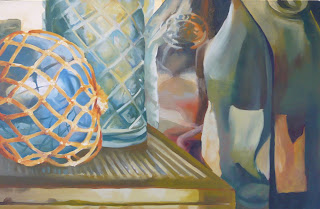
We painted a still life on the first of our large hand-made canvases. My teacher set up several still lifes, one of all glass objects, one of all metallic/reflective objects, one of all white objects, and one of all wooden objects. I chose to paint the glass still life because I liked the assortment of bottles and I wanted a challenge. My painting looked so much different (not as good) for our still life critique; since then, I painted over all of it for my final critique with my professor. I'm glad I redid it because it so much better!


Here again is the portrait piece. I did go back into it and repainted the neck to make it match the face color better. I also corrected the circle behind her. Even this looks better now, in my mind.


Then we had a mixed media project. I chose to make another panel for this piece instead of a canvas. My idea for this piece was painted cake, so much cake that it make you sick. I was influenced by Rococo things and Marie Antoinette's quote "Let them eat cake!" I definitely have a love hate relationship with Rococo Art. It's very pretty and whimsical but it is art for rich people about being rich. I tried to illustrate this through the disgusting amount of sweetness. I did not use any really food! Instead I used polymer medium and gel to create the illusion of frosting. Polymer medium and gel are used with acrylic paint. They allow you to extend the quantity of your paint by mixing a little bit of paint pigment (or color) into a large about of medium. I used the medium and gel for their physical characteristics. Polymer medium is very soupy and dries clear when it's used by itself. The gels come in different viscosities. There are heavy gels, smooth gels, regular gels, etc. I selected the get that had the same viscosity as frosting to mix with my paint. Then I put that "frosting" into a cake decorating bag with tip and literally frosted my panel. I had laid down objects, like clocks, frames, and modeling, along with insulating foam to give my panel more dimensions of depth. All of the little "candies" were made out of polymer clay. I had so much fun on this piece!!!


The last piece we did was a free choice. I chose to paint a cityscape of a place in my sister's most recent novel. This city, a legendary city, is lit by a giant moon rather than the sun. This might one of my favorite paintings that I did this semester (the portrait being my favorite)!

Wednesday, November 4, 2009

The End of Digital Printmaking

My five weeks in the Digital Printmaking of my Materials class have come and gone. We finished the class with eight prints and my book The Hidden Face of the City is now available on the website lulu.com. It's so cool to think that I've actually made a book; you don't believe it until you're actually holding the book in your hands! My book ended up being 30 pages long with four poems written by my sister.


This is my favorite page: the Seven Dwarfs' cottage. The creepy grinning figure on the magic mirror is my version of Death from Hellboy II and it holds the red apple that 'kills' Snow White.

Although I felt some of the assignments in Digital were rushed because we only had five weeks, the class made me appreciate Photoshop more. Throughout the entire class I had a distinct image or look I was going for on Photoshop but I could not get it to work until the very end of the class (funny how things work out like that). What I was striving for was a print "painted with patterns or textures". The cartoon show "Chowder" on Cartoon Network uses the same idea: all of the characters' clothes have patterns on them and as the character moves across the screen more of the pattern is revealed (as if the character's shirt is moving along the pattern). It's hard to explain...

Bellow, is my first attempt at paste-ing in patterns. The assignment behind this print was to create four prints using scanned images or things. I scanned in cool different textures (knitting, cloth, metal hair clip) for all of the different parts of the elfin knight's armor and background. I also collaged sketches of faery creatures in the background. After this was done, I still didn't feel satisfied!


This is just another of the scanned prints.


This one bellow is the one that finally worked out!


So what I ended up doing was scanning in a line drawing that I had done in pen and on that scanned image I copied and pasted textures or photos into each of the distinct shapes of the drawing.

If I had figured out my idea earlier, I would have tried to make more prints using the same technique.

Thursday, October 29, 2009

Portrait Paintings

We just finished portrait paintings in my basic painting class. What my professor did for this assignment was take photos of each of the people in my class and print them out. Then each of us (the students) drew from the pile of pictures she took and had to paint that person. We could take on whatever kind of concept we wanted with the portraits and didn't have to paint each other realistically. The girl that I picked had really cool hair that reminded me of a halo. That and the fact that her head was slightly tilted to one side and faced the camera head on inspired me to paint her like a Madonna or an early Christian icon painting. While painting, I also drew a lot of influence from the art nouveau artist Alphonse Mucha because his works contain a lot of haloed or framed women.

Here's my painting.


This was painted with oil on a wood panel that I built myself. I love how the wood panel is so appropriate for my concept: all of those early Christian icon paintings were usually painted on wood for alterpieces. Also, the student that I painted is an art history major so there is that reference to her in the painting.

Madonna and Child painting.


This and the early Christian icon painting bellow both have a lot of gold in the background. This was done so that the figures are pushed forward as well as making them look like they are floating on golden light when sunlight hits the background.

Early Christian icon painting.


Here's a good example of and Alphonse Mucha print.


Thursday, October 1, 2009

Digital Printmaking

We are making our way through Digital Printmaking, the second section of my Printmaking course this fall semester. We've made digital prints using photoshop and scanned images. I've also gotten a chance to do some fun photoshop tutorials. This picture I did below was a "city ink" style tutorial that makes any picture look urban and 'popping fresh'! I thought it would be hilarious to do it with one of my French Rococo Pirate costume pictures. Here's what I would look like as a pirate in some cool city!


Right now we're working on books. Everyone is making a 20 page book in photoshop that we will send to lulu.com to get published. I'm so excited about this project. Even when I was in etching, I had heard a rumor that in digital we made books and knew immediately what I was going to do. I started taking photos and drawing/painting images early on! The idea or concept behind my book is based on a phenomenon I encountered last year: I noticed all of these picturesque scenes in Richmond that if you boxed out the rest of the city surrounding it, the building or whatever it is doesn't even look like it's in Richmond. Sometimes buildings look like a tower in Germany or, as I like think of them, holes into Faerie. That's when my concept really takes off. I'm going to emphasized these non-Richmond cites and describe them as holes or portals into the Faerie world with creatures coming out and mortals getting trapped in. The book is a journey of discovery; it starts off with pictures of just Richmond, then progresses to distorted pictures of Richmond that focus primarily on the interesting building or feature, and then the faeries take over. My sister has written up poems to accompany my book, one being the introduction. It's amazing how perfect her poems are for my book when she hasn't actually seen any of the pages or sketches!

Here are some spreads from my book (by spreads I mean the two corresponding pages, so imagine them divided down the middle as they would be in a book). Enjoy!


Wednesday, September 30, 2009

A New Semester!!!

I bet you're hoping that the long break between this and my last post means I've been up to a lot of work and have much to share but sadly this is not the case. Over the summer, I experienced a 'loss of creativity' and hardly drew or painted like I normally would have. I am happy to say, though, that my creativity is on a rise as this new semester begins.

I'm taking a really exciting class on different forms of printmaking. The class is made up of three five-week sections. The first section was etching. I've already handed in my final portfolio for that portions so it's over now. I'm currently in digital printmaking and then I'll be going to litho (lithographs). I love etching! I had not realized that the verb 'etching' does not describe the action of drawing with a needle tool onto a copper plate but rather soaking the copper plate in an acid bath so that the acid burns (or 'etches') the lines into the copper. Can you imagine my confused-open-mouth expression during my first two etching classes when my professor kept saying things like "you could get a deeper line by etching for twenty minutes rather than five"? I was sitting there thinking "how can you draw a line for twenty minutes. Now, etching is like common sense to me! Before etching, you apply some sort of ground on the copper plate that protects it and you remove the ground when you draw or mark on it. The acid then 'etches' away the exposed copper. There is one technique, called drypoint, which you draw right onto the copper and don't put it into the acid bath at all. I guess that's what I thought etching was!

We had to find a printmaker/artist and pick out two of his or her work that we would make prints in response to or inspired by. I picked the Japanese artist Yoshitaka Amano. My first print is a combination of drypoint and hard ground. Hard ground, a blackish liquid that dries into a hard coating, is one of the two different grounds you can put on a plate. The resulting etched lines are crisp and pen-like.

Here is my first selected Amano piece, a print of the character Vampire Hunter D.


In this piece, I was inspired by Amano's 'epic figure' as I like to call it; I loved the isolated figure with his flowing cape and dynamic pose. In my own print, my figure is a sort of grotesque monstrous creature but rendered in a very beautiful graceful manner. I like the idea of body parts switched or in unusual places; here, I put the arms where the wings would be on the back (if humanoids had wings). The birdman, as I tend to call him, has two faces and, I like to imagine, another or more that we can't see.

Here's my final print.


My next piece, titled "The Bonfire, an Aboriginal legend", illustrates an Aboriginal legend about the creation of the sun that I found in a children's book back at the library. The story goes: Baiame, the creation god, was creating all sorts of creatures but they weren't right, they kept growing bigger and bigger and ended up fighting or eating each other. At this time, there was no sun so Baiame and the other god Punjel lived out in the cold Milky Way. They kept gathering wood for a great fire. Punjel asked Baiame when they were going to light the fire and was peeved to find out that fire hadn't been created yet. Baiame told Punjel not to rush his creations and sure enough an egg fell from the sky. Punjel tried to catch it but it broke all over their fire wood and errupted into a blazing fire. The gods could finally see the beautiful world Baiame had been making (I think it's funny he's been working in the dark) and admired his handy work. Baiame then desides to make delicate and complicated creatures like silver fish, tiny bugs, lizards, birds, and man for the world. At the end of the story, the fire starts to go out and Punjel urges Baiame to relight it but he just says that man will call the light their sun and every time it goes out they will sleep and Baiame will relight the fire for the new day. (this is my favorite part) Punjel askes Baiame what is sleep. Baiame says sleep is like death but not death. Man needs to sleep because life tires him or her out. Punjel says in response "How odd". This story is so 'deep' within its simplicity. I hope my print does it justice!

Here's the other Amano print I selected.


The Amano print I picked for this particular concept had lots of textural details (squiggles and lines) that I thought would be great for the portion of my print where the firelight reveals Baiame's creations. This print is primarily softground, the second type of ground that is waxy and keeps the texture of the tool you use to expose the copper underneath (so a pencil line will etch and print out like a pencil line, a marker line will look like marker, charcoal will look like charcoal, etc.)

Here's a close up of the wonderful, textural 'squiggles' I was inspired by!


And here is my final print! I'm supper pleased with how this one turned out.


Tuesday, July 7, 2009

Je suis une PIRATE francais!!!!


I am a french PIRATE! Avast ye!!!!! Here is the complete costume: corset overdress, blouse, pantaloons (aka britches), white leggings, shoes, fan and wig! I'm extremely happy with how my costume came out; it's very Marie Antoinette and incredibly ridiculous. Who in their right "pirate" mind would go treasure hunting in such a silly ensemble. Both my dad and my friend's dad had the same reaction: "I thought it was a pirate costume". Weren't there any French pirates?!!!! I guess most people today think of Jack Sparrow when they hear "pirate costume". Well, I don't!


Here I am looking sweet!


Here, looking sweet with the fan!


I changed my color scheme. Instead of golden britches, I went with a powdered blue. The shirt is a cream color, not white.


Detail of the overdress and the lacy blouse.


The make-up is so fun to do! I used red lip stain, pink eye shadow for the blush (because I don't have any red blush), and liquid eye liner for the beauty mark. I think scars over my left eye would add some edge to this fluffy pirate.


Au revoir! xoxo

Tuesday, June 2, 2009

French Pirates!!!!!

My sister has gotten far enough on her next novel to read parts of it out loud (that's approximately 20 chapters). The part that she has read to me is set in a french fairytale style. Imagine satin dresses with lace, buckled shoes, britches, and of course fairy godmothers! This set me up in a Marie Antoinette mood. I've been watching movies set in that French Baroque or Rococo time period, such as Blackadder with Hugh Laurie as Prince George.


I prefer Prince George over House any day!!!!

I've also been reading french fairytales illustrated by Edmund Dulac as well as drawing my own Rococo fairy pictures.


This drawing is done with graphite and colored pencil, like the faery queen in the previous blog entry.


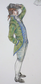
I definitely drew this fellow while watching Blackadder.

A couple of days ago when I was thinking of pirate costumes for a Live Action Role Playing Game, I realized I could make a French pirate costume! Let me back up. Live Action Role Playing Games (LARPs) are similar to those murder mystery parties where people dress up and play a character. The LARPs my brother and I participate in sometimes have murders but are set in the future or fantastical worlds. The next LARP planned is a pirate one and I've decided to make a Rococo Pirate costume. I've already started part of it. The costume has a brocade over dress (the only part I've made so far), britches and a blouse.


This is the first thing I've sewn that's had boning and eyelets in it. I'm extremely happy about how it's coming along!


My color scheme is going to be a silver/gold over dress, dark gold britches and white blouse. This isn't final. I'm going to the fabric store tomorrow to pick stuff out.